Circle Graphs
- A circle graph is divided into sectors of a complete circle to represent categories and their values.
- A circle graph is sometimes called a pie graph or pie chart.
- The area, central angle and arc length is proportional to the size of the category represented.
- An exploded circle graph has one or more of the sectors separated from the rest of the circle.
This is normally done to emphasize a particular category.
- Circle graphs are used to visually compare the size of different categories.
How to Create a Circle Graph
- Determine which values need to be shown in the circle chart.
- Create a data table with the categories in one column and the associated values in another column.
- Make a third column for the angle for each category.
- Determine the angle for each category by determining the proportion of the total circle that belongs to
each category. The total of all the angles should equal 360o
- Divide the circle into the appropriate sectors by drawing the appropriate angles.
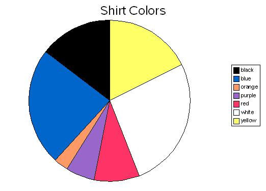
Circle Graph Example
|